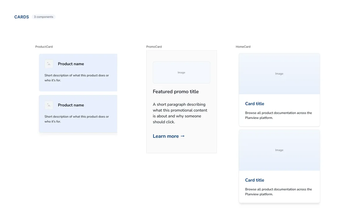
When one platform starts to feel like several
As the CSC expanded, every new initiative brought another set of design decisions.
Over time, customers encountered different card styles, spacing, typography, imagery, and interaction patterns across sections of the same platform. Familiar things didn’t always feel familiar.
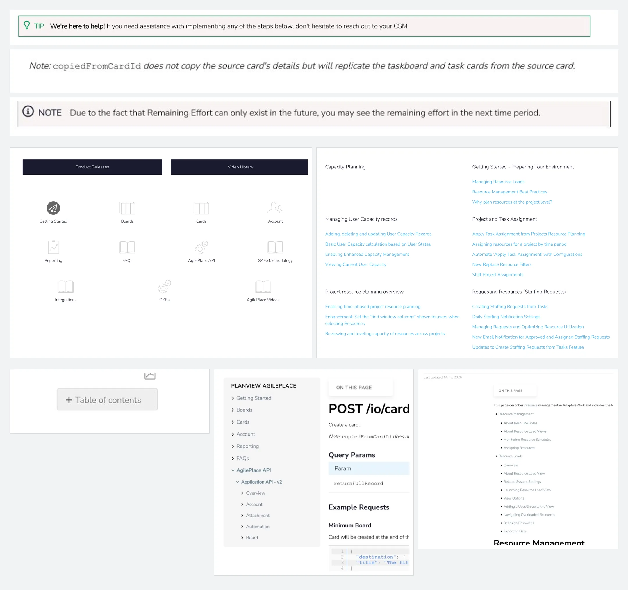
Customers moved between very different kinds of content, but repeated interactions still needed to feel familiar.
How might we create enough consistency for the CSC to feel coherent while leaving enough flexibility for different kinds of customer experiences?
Finding the right level of consistency
I audited repeated patterns across the CSC to identify which decisions should become shared foundations, which should become reusable components, and where individual experiences still needed flexibility.
The goal wasn’t to make every page identical. It was to make the underlying rules predictable.
Creating a shared foundation
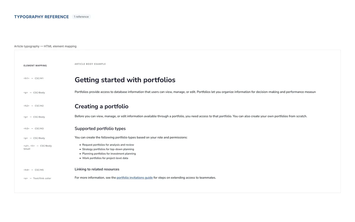
I created a shared foundation in Figma that aligned with Planview’s broader product language while accounting for the needs of the CSC.
- Semantic colors — created consistent meaning.
- Shared typography — established hierarchy.
- Design tokens — made foundational decisions reusable.
Making interactions predictable
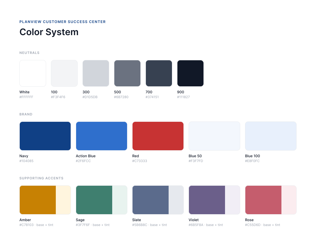
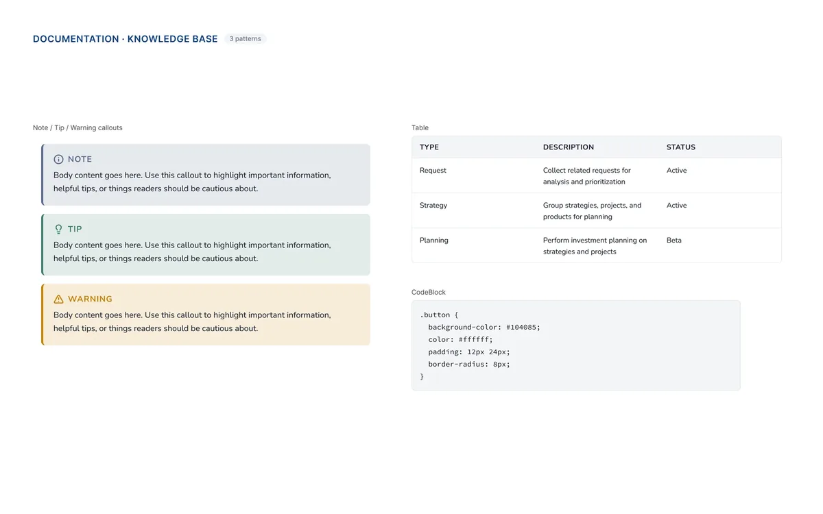
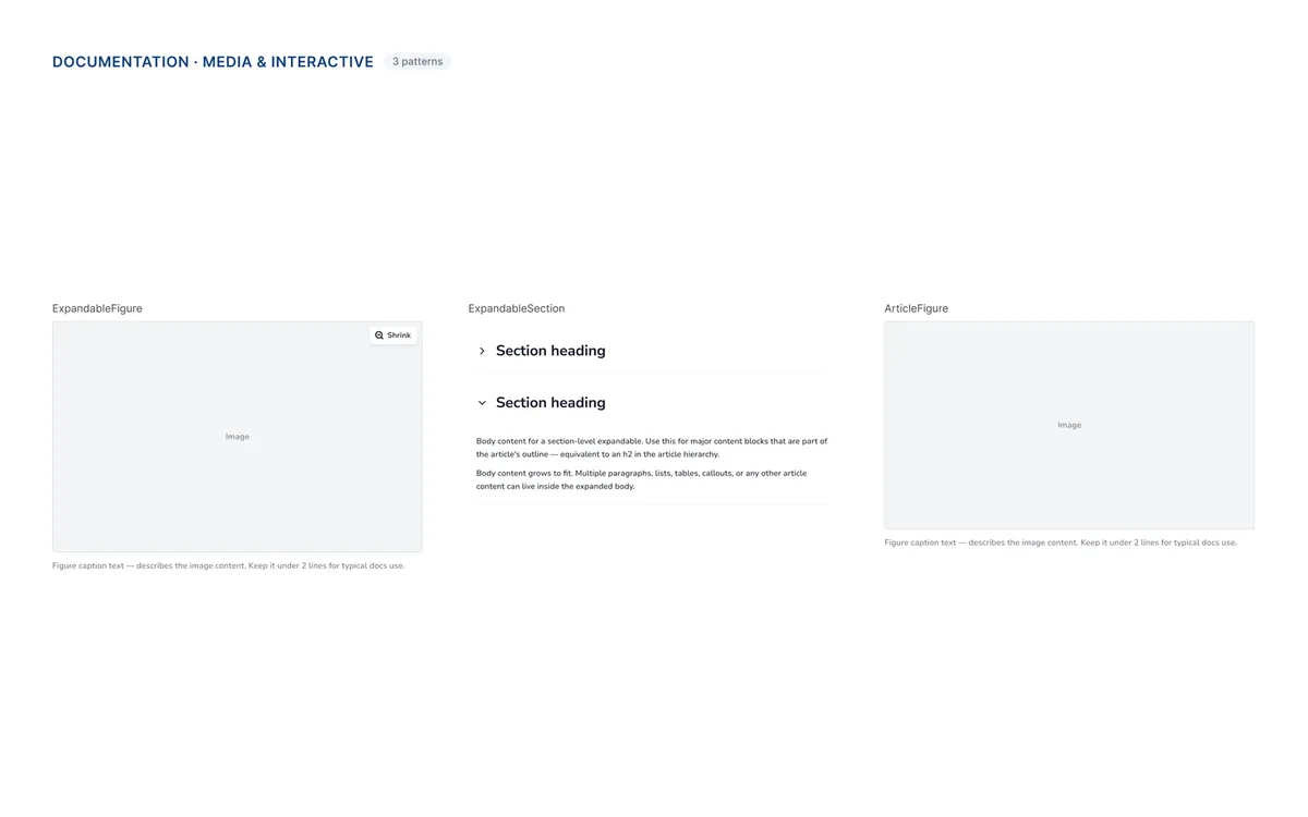
I standardized repeated patterns including cards, callouts, tables, figures, code blocks, and expandable content.
When customers encountered something familiar, it should look and behave the way they expected.
Designing for real content
The CSC supported everything from dense technical documentation to services, programs, and promotional pages inside an existing CMS.
The system needed enough structure to create familiarity and enough flexibility to support very different kinds of content.
Systematizing the visual language
The CSC’s new visual direction also needed to work beyond individual pages.
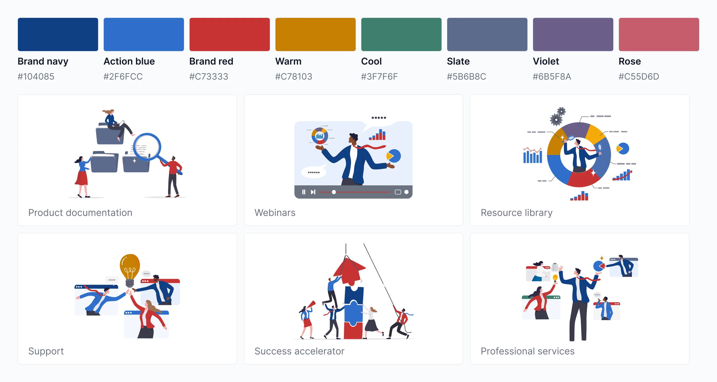
I translated the palette, illustration treatments, and supporting visual patterns into reusable guidance so new experiences could feel distinctively CSC without reinventing the style each time.
From component to experience
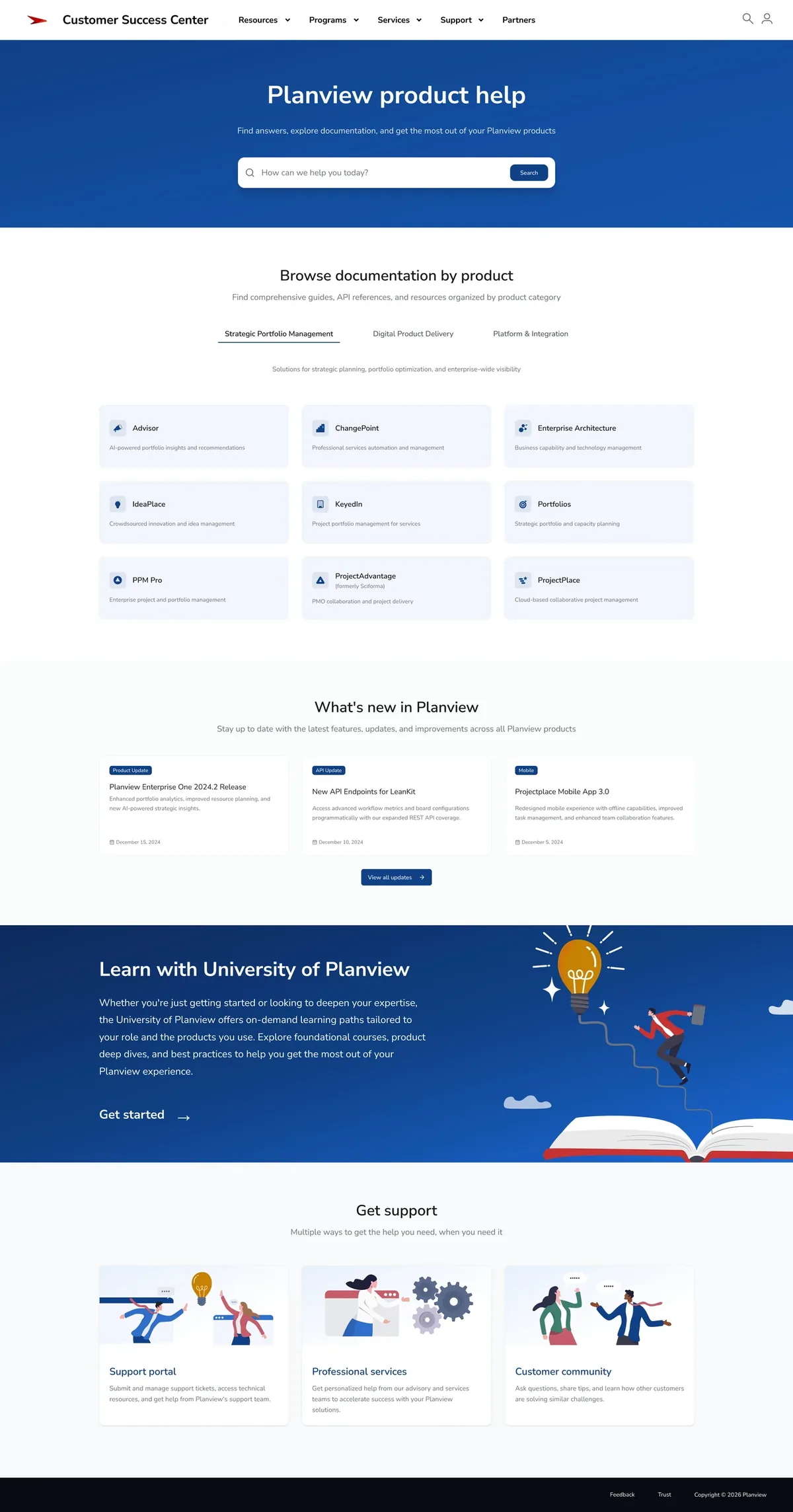
The system gave new projects a place to start.
Web Development could reuse established patterns instead of rebuilding familiar interactions, while customers encountered a more coherent experience as they moved through the CSC.
What I learned
Consistency is learned behavior
Uniformity was never the goal. Dense technical documentation and promotional pages needed different amounts of structure. What stayed consistent was how familiar patterns behaved — cards, callouts, tables, in-page navigation — so customers could apply what they’d already learned as they moved through the platform.
A design system serves two users
Customers experience it as familiarity. Web Development experiences it as reusable patterns instead of rebuilding the same interaction repeatedly. The system held because it was useful to the people building on it, not only the people using it.