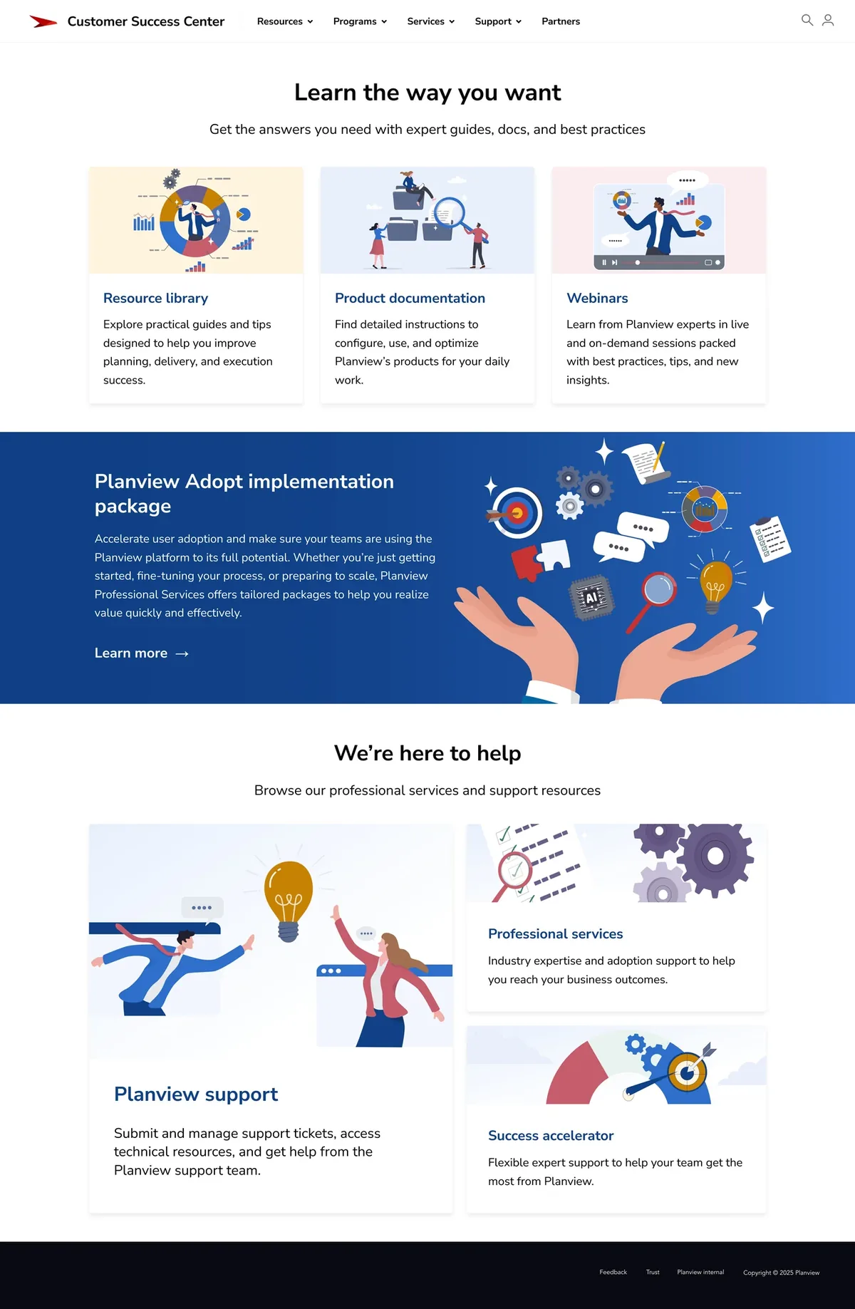
Hearing where customers got stuck
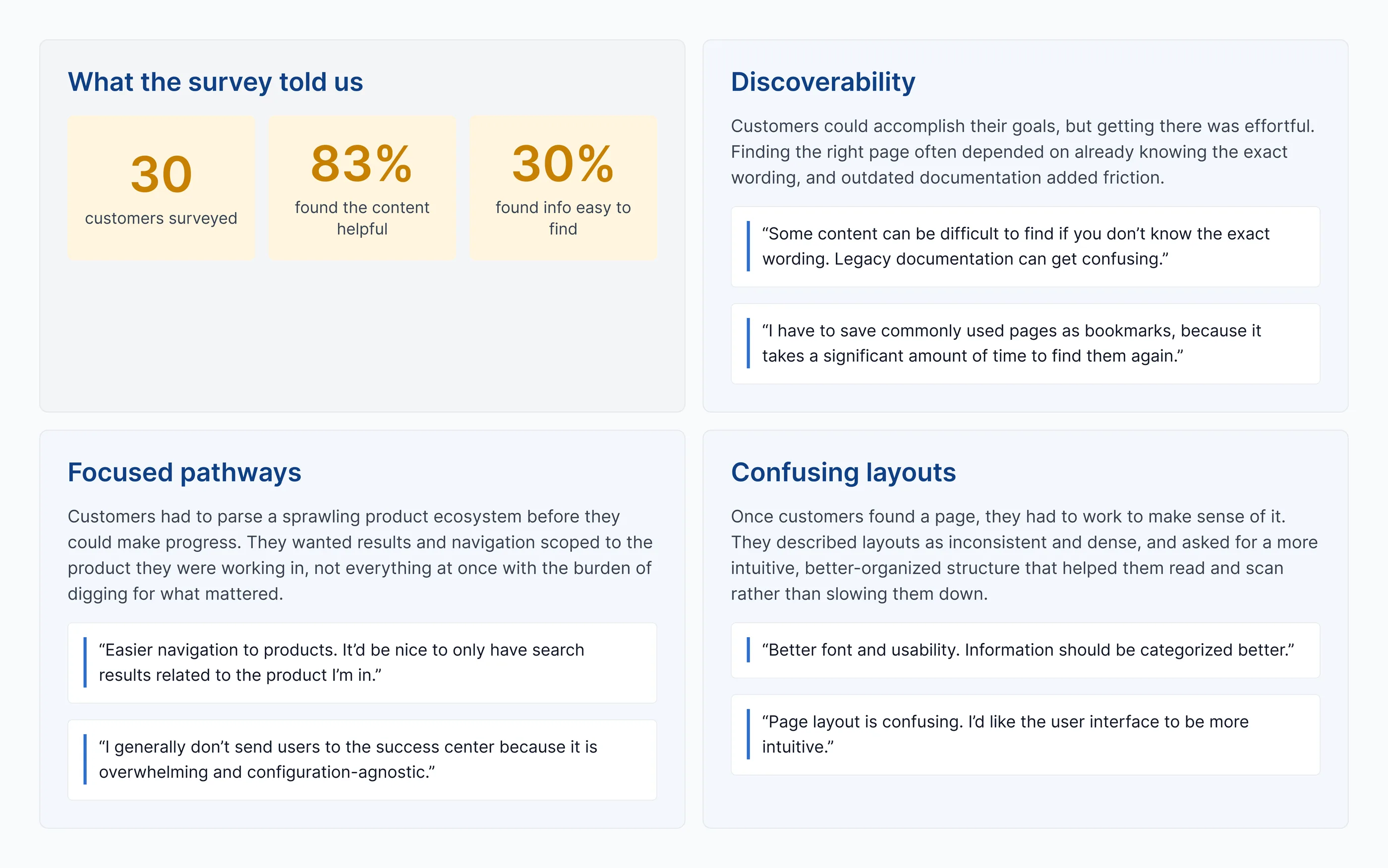
I surveyed 30 customers about how they used the CSC and where they struggled.
- Finding the right words — Customers struggled when they didn’t already know Planview’s terminology.
- Staying oriented around their product — Customers wanted stronger ways to browse and search by product.
- Making sense of dense pages — Inconsistent layouts made information harder to scan.
The CSC needed to keep growing without asking customers to understand more of Planview in order to use it.
How might we help customers find the right path through a growing product ecosystem without requiring them to understand how Planview organizes its content?
Designing around what customers came to do
Customers had a simpler mental model than the platform reflected. They thought about the product they used, the question they had, and what they needed to do next.
I explored the information architecture around three principles: customer goals over internal ownership, patterns that could grow with the platform, and predictable interactions that reduced cognitive load.
Giving the platform a clearer map
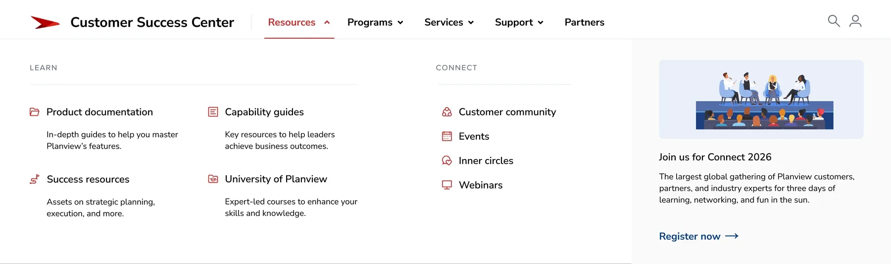
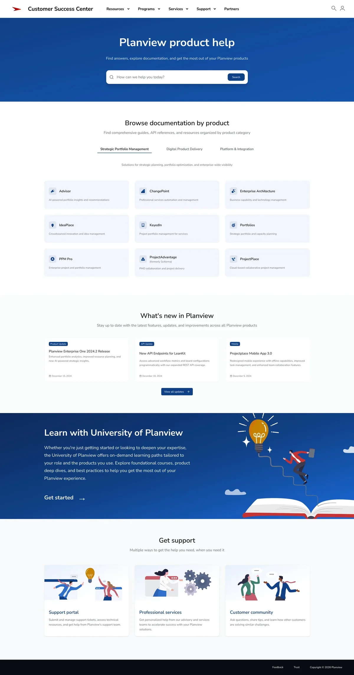
I reorganized global navigation into four destinations: Resources for documentation, learning, and community; Programs for customer engagement and innovation; Services for professional and advisory services; and Support for help and product support.
The categories gave customers a smaller, clearer decision to make before moving deeper into the CSC.
Starting with what customers already know
Research showed that the product itself was one of the strongest anchors customers had.
A customer might not know which Planview team owned release notes, training, or Professional Services. They did know which product they were using. I designed a centralized hub that let customers start there and find the resources connected to it.
Designing a place customers want to spend time
Customers often came to the CSC when they were learning something complicated, looking for an answer, or trying to get unstuck. I wanted the experience to feel clear and trustworthy without inheriting the stiffness of traditional enterprise support sites.
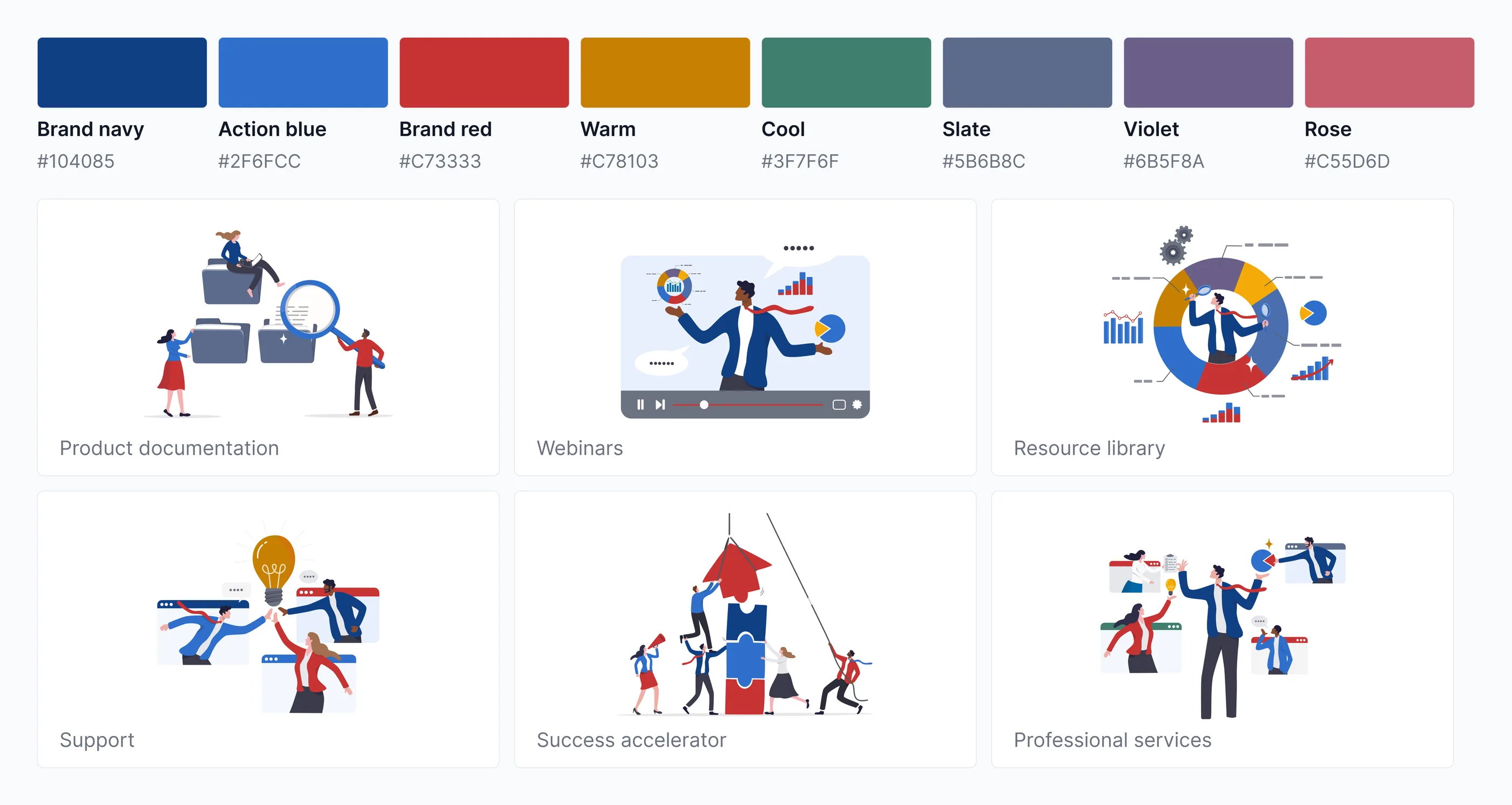
I paired familiar Planview brand elements with a brighter palette and custom illustrations, giving the CSC its own personality while keeping it connected to the products customers knew.
+10 points
Customer Success Center NPS
The redesign established the Customer Success Center’s first design system and transformed a growing collection of customer resources into a cohesive customer platform.
The platform continued evolving on this foundation for years after launch. During that period, NPS increased by 10 points alongside broader improvements to the customer experience.
What I learned
Customers anchor around products, not solutions
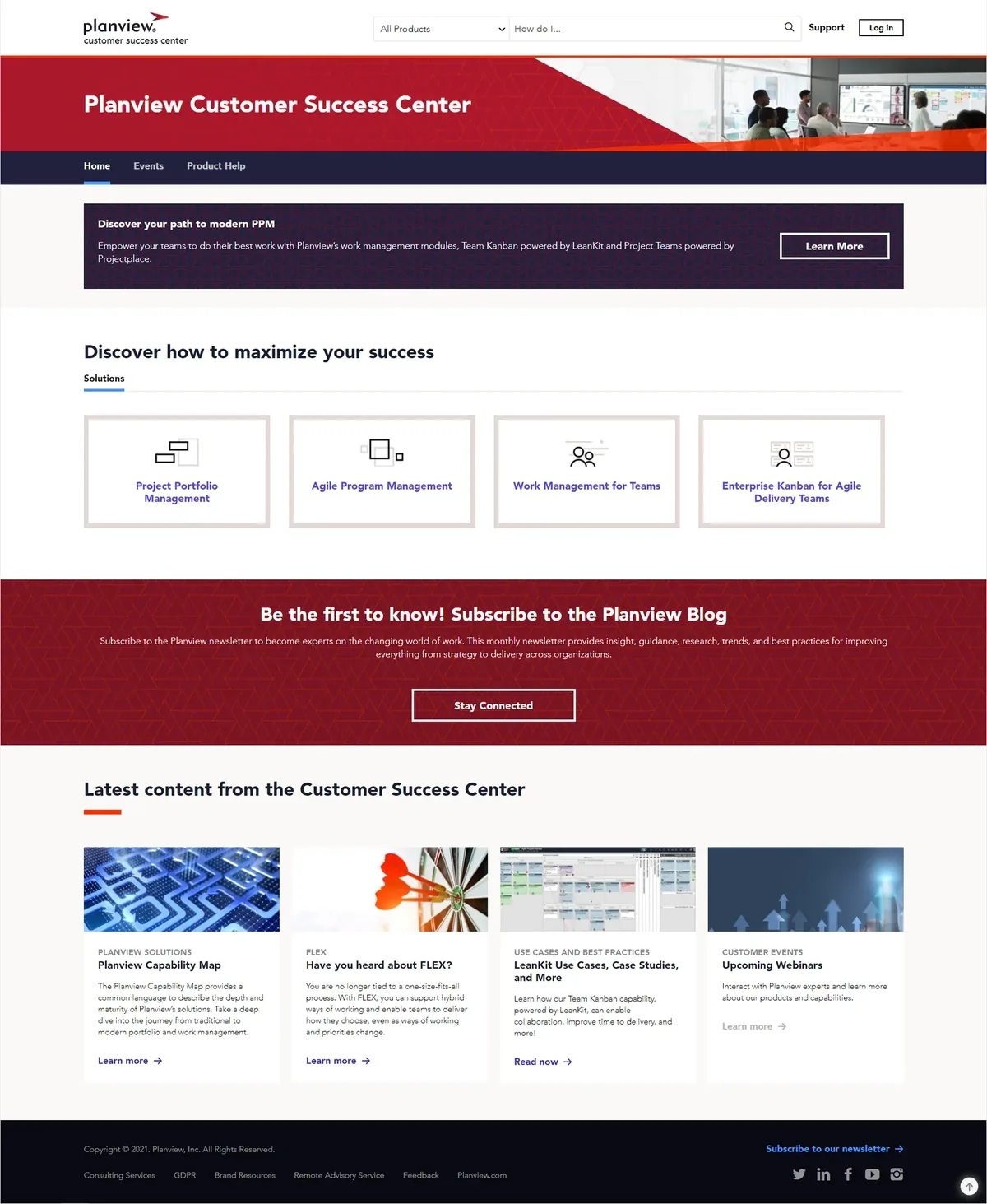
The old homepage sorted the platform into solution categories like “Enterprise Kanban for Agile Delivery Teams.” Customers didn’t describe themselves that way. They knew which product they were using. Building the hub around products removed a translation step that had nothing to do with the question they came to answer.
Structure should survive growth
The same foundation kept supporting new products, services, programs, and resources as the CSC grew. A structure that only fits today’s content is one you rebuild later.