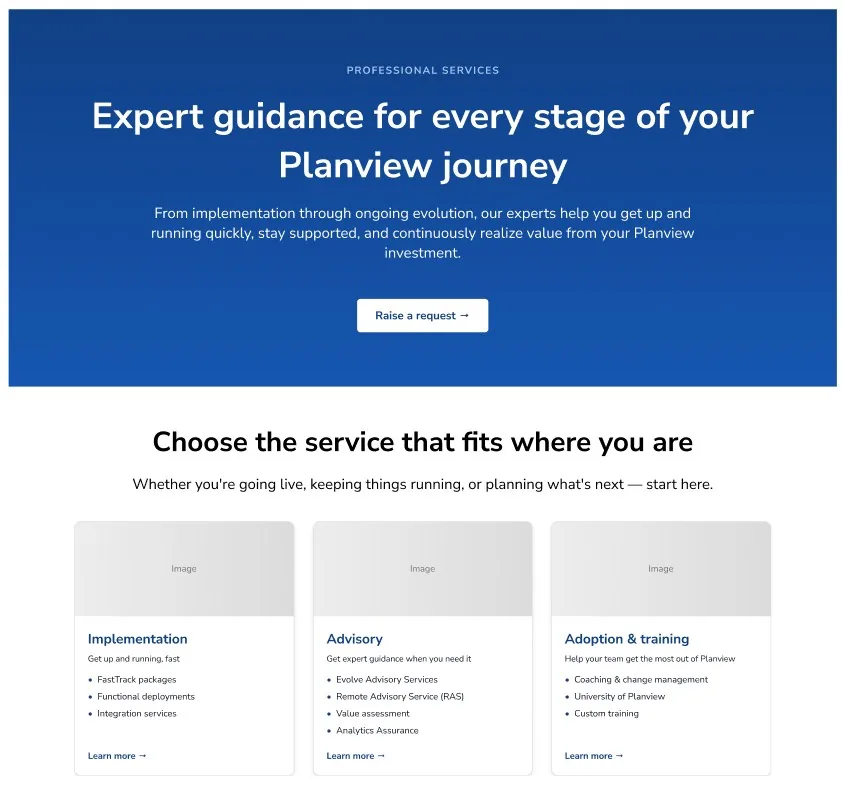
Seeing the portfolio through a customer’s eyes
I audited every service, heading, link, and call to action across the section. More than a dozen offerings surfaced three recurring questions:
- Where am I in the journey?
- What does this service name mean for me?
- How do I compare my options?
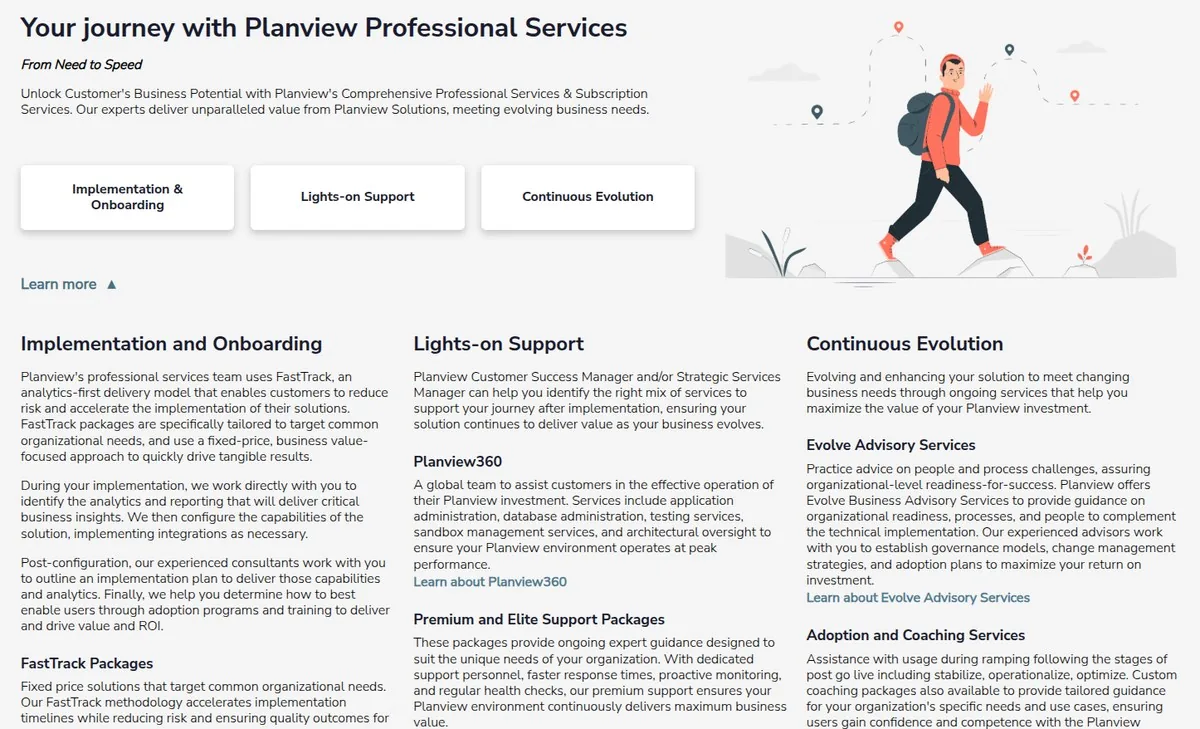
Customers weren’t arriving with a service name in mind. They were arriving with an implementation, adoption, or optimization need.
How might we organize a complex service portfolio around situations customers recognize, so they can understand their options and confidently choose what to do next?
Finding the right organizing model
I explored different ways to group the portfolio, including existing service categories and customer needs.
Organizing around the customer journey gave people the clearest starting point because it began with a situation they could recognize before asking them to understand Planview’s offerings.
Meeting customers where they are
The new structure created three starting points:
- Getting started — Implementation and onboarding.
- Staying on track — Guidance and ongoing support.
- Growing your investment — Adoption and continuous improvement.
Making services easier to compare
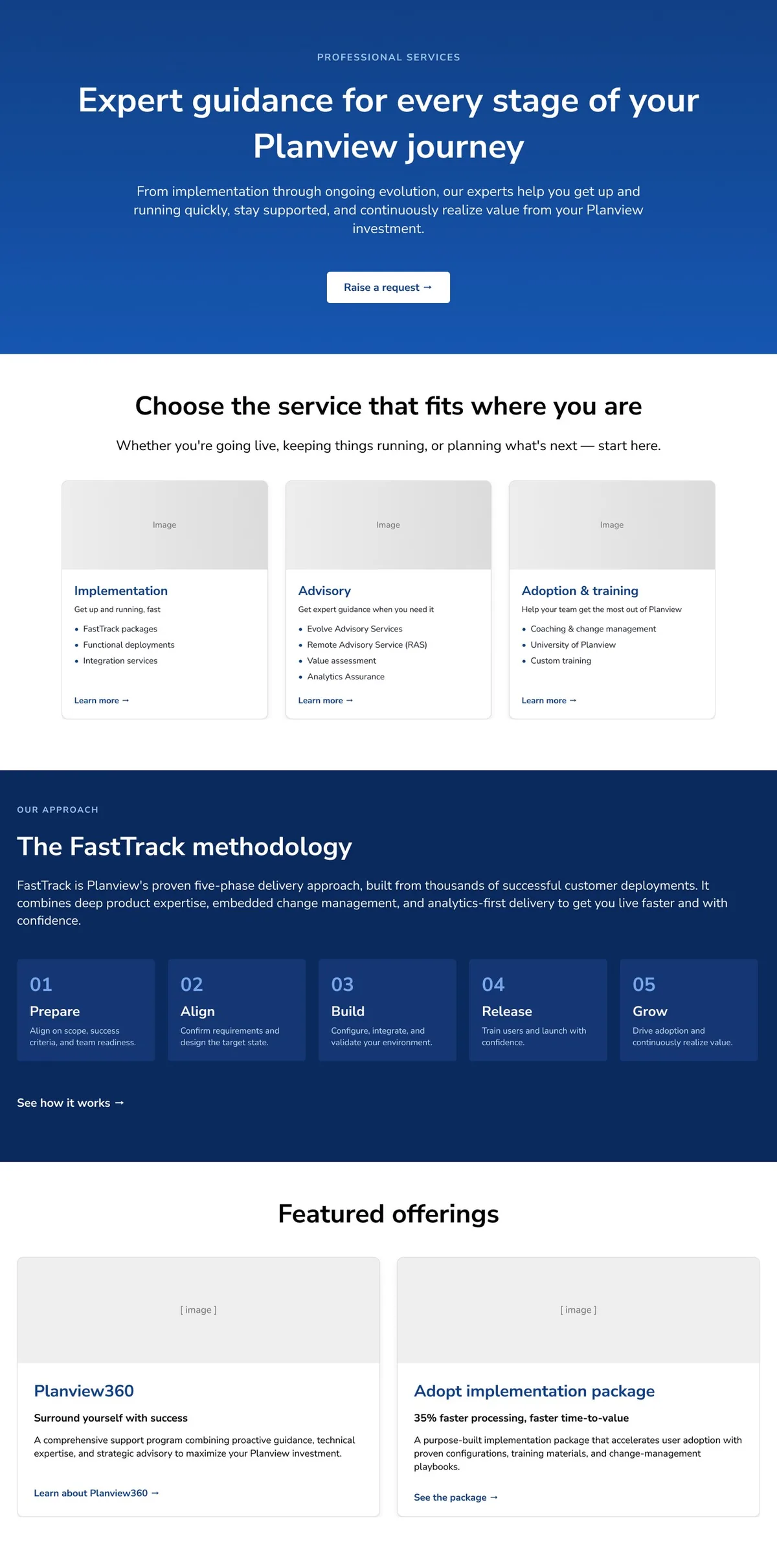
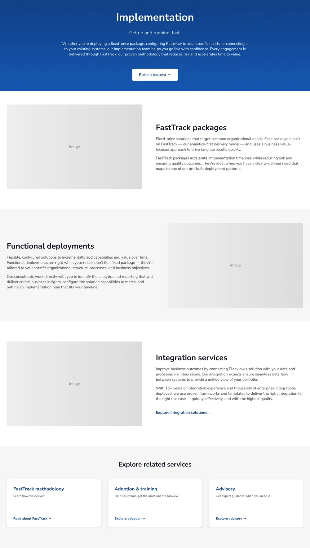
I standardized and rewrote service descriptions so customers encountered the same questions in the same order: what is this, when would I need it, and what should I do next.
The structure preserved the nuance of each offering while making the portfolio easier to scan and compare.
Taking the design into development
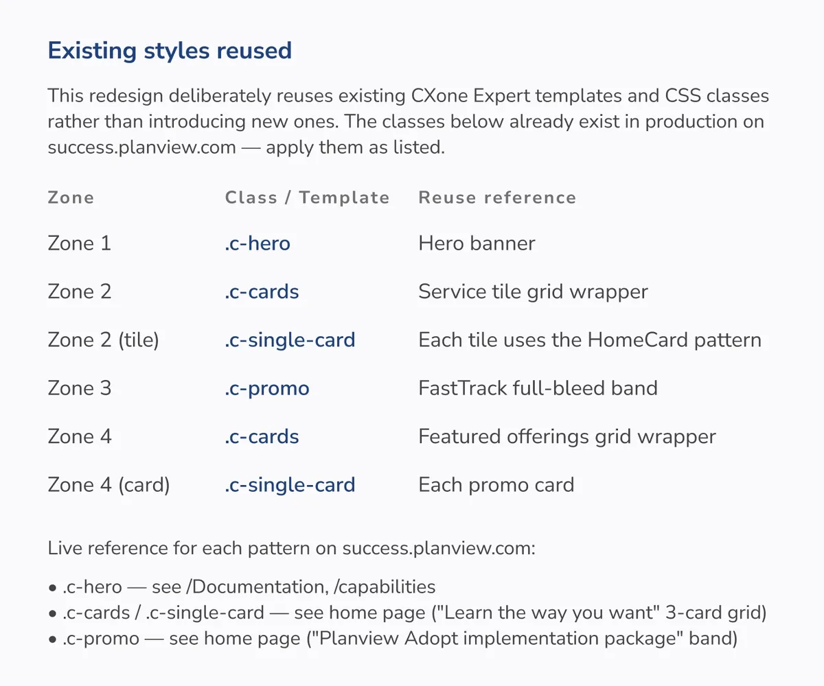
I used Claude during exploration to compare patterns and test alternative content structures, then later to accelerate detailed developer handoff documentation.
That left more time for the decisions that required judgment: hierarchy, language, customer needs, and stakeholder priorities.
What I learned
Information architecture comes before copy
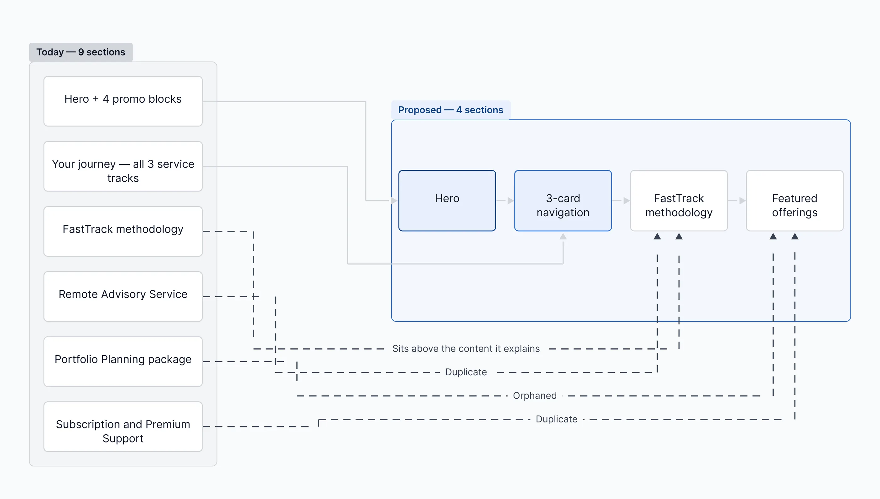
Clearer descriptions helped, but the portfolio was still organized around Planview’s internal service catalog. Nine sections became four before the writing could do its job.
People compare before they choose
Every service answered the same questions in the same order: what is this, when would I use it, what should I do next. That consistency made the portfolio easier to compare, not just easier to read.